Qumpoo Inc.
A Digital Branding Agency in Yokohama

Project Details:
Client: Qumpoo Inc.
Project Date: October 2020
Category: Branding, Web
View Project: https://www.qumpoo.com
Description:
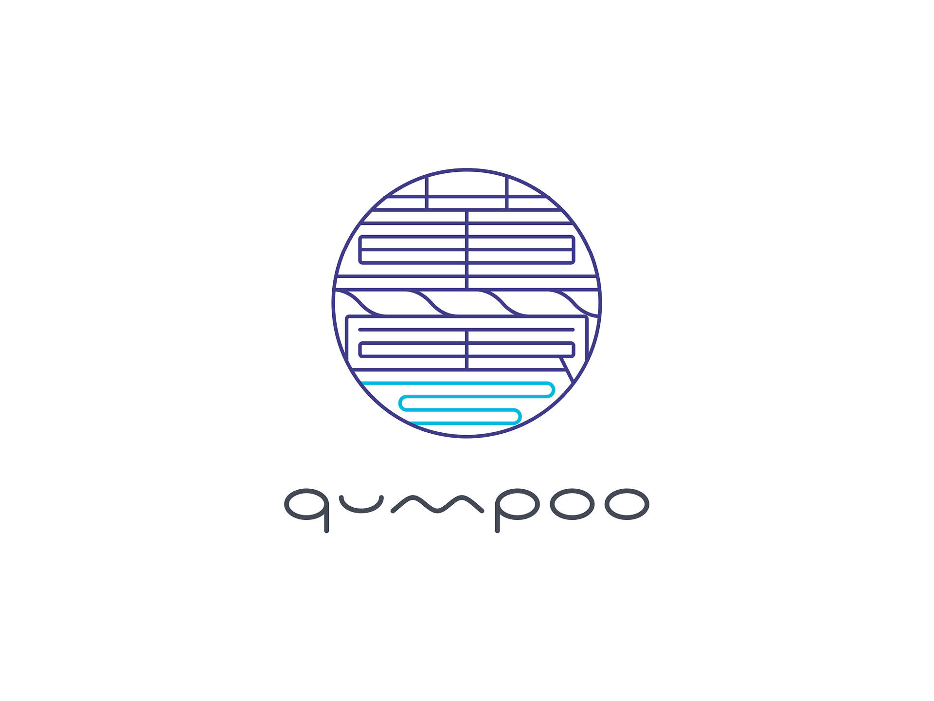
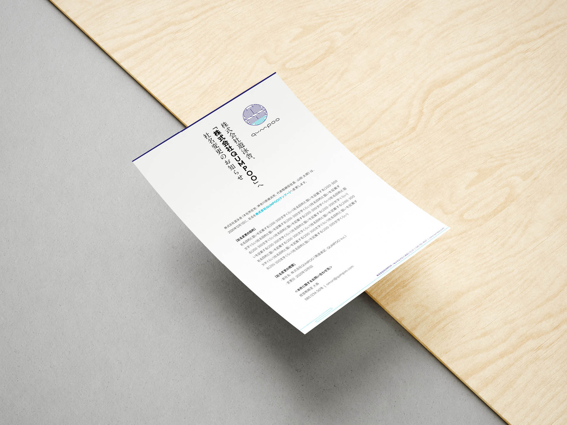
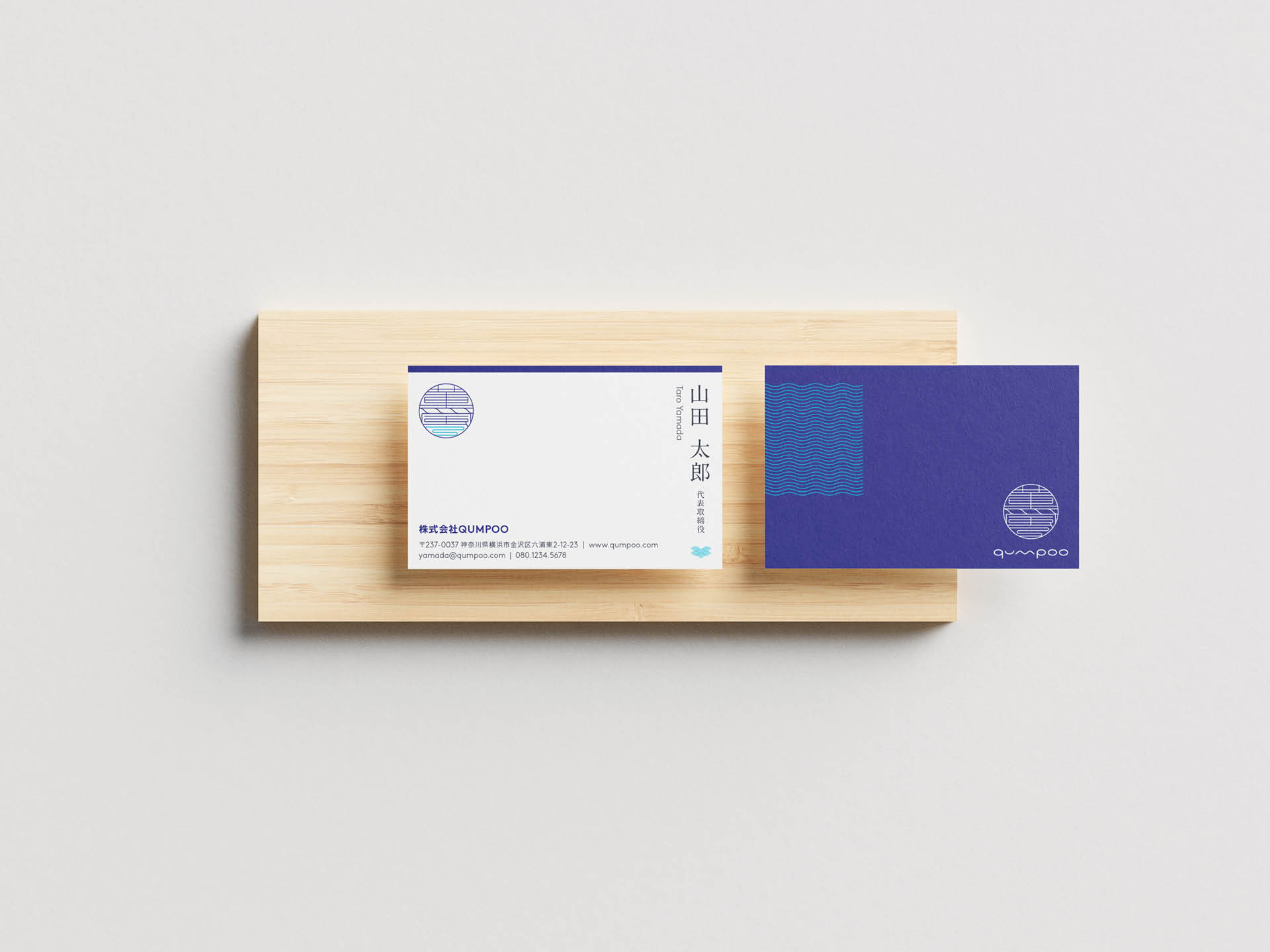
Qumpoo Inc. (薫風) is a digital branding agency in Yokohama. Since Yokohama is a bayside city, the symbol has wavy lines in 薫, and the waves of the bay under 風. The symbol is just like Japanese seal while its extremely geometric shapes and lines leaves modern look & feel, but it becomes playful with the word mark. The whole design system is somewhat serious but playful by combining a serif font in vertical orientation and a geometric sans serif font, and using wave pattern for Yokohama-ishness.