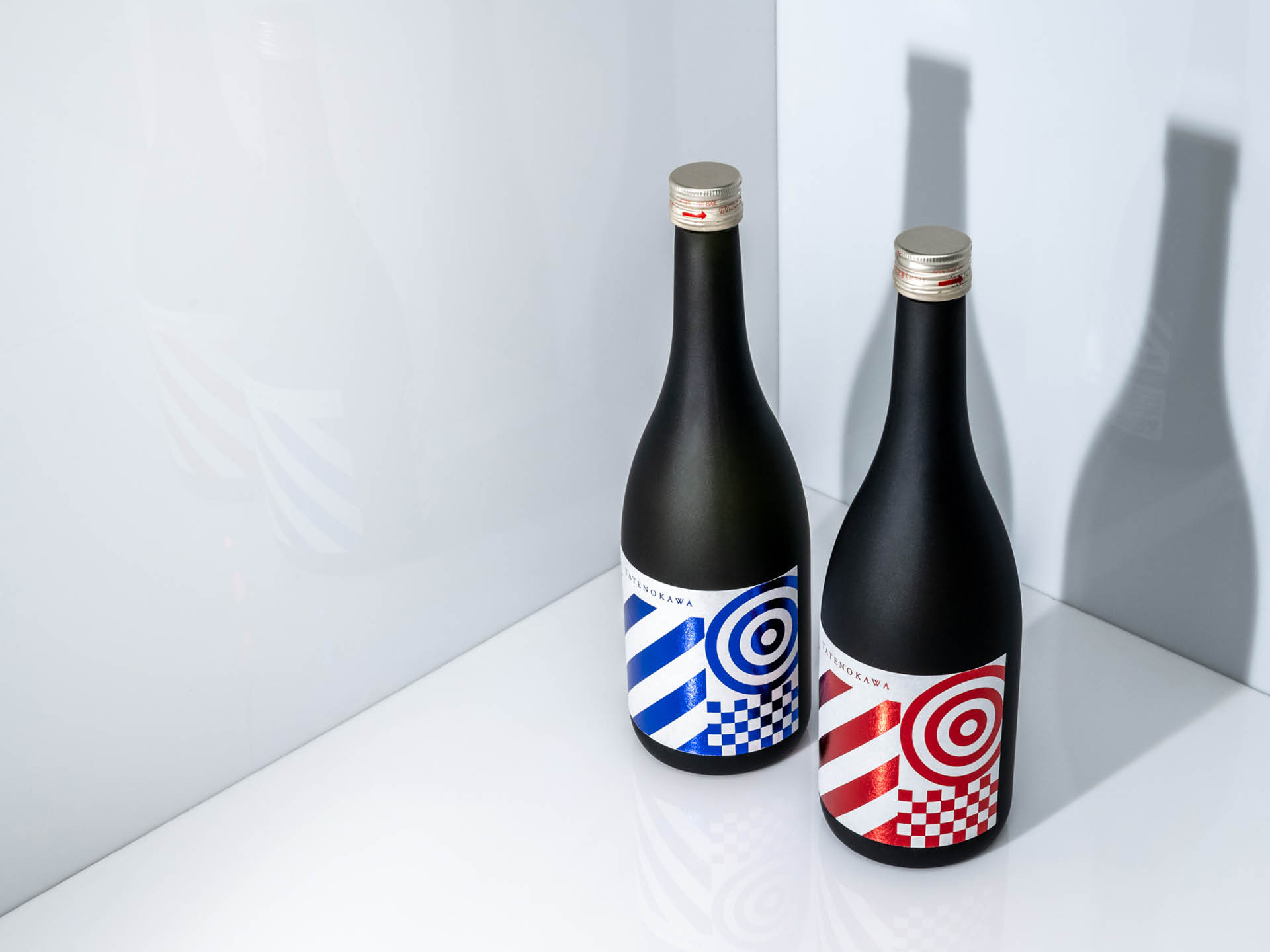
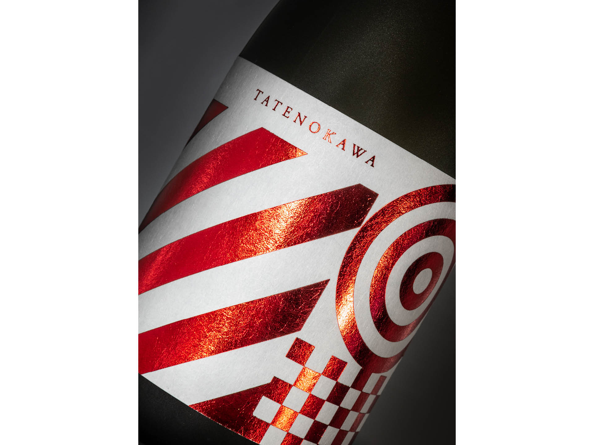
Tatenokawa Kura Matsuri Special RED & BLUE
Bold but Abstract Communication of Japanese Sake
Project Details:
Client: Tatenokawa, Inc.
Project Date: April 2021
Category: Package Design
Photography: Tokio Kuniyoshi
Tatenokawa Sake Brewery is a sake brewery located in Yamagata Prefecture that produces only Junmai Daiginjo. The project is to design a label for a set of special sake which will be sold only at Kura Matsuri — Brewery Festival.
The concept is to communicate positive energy for the after-COVID future. The approach is, to keep it very simple but communicate sake-ish look and feel using strong graphical patterns and the double circle on the upper right which is a traditional sake symbol.
The RED is dry and the BLUE is sweeter. It would be nice to taste both and compare them 🙂